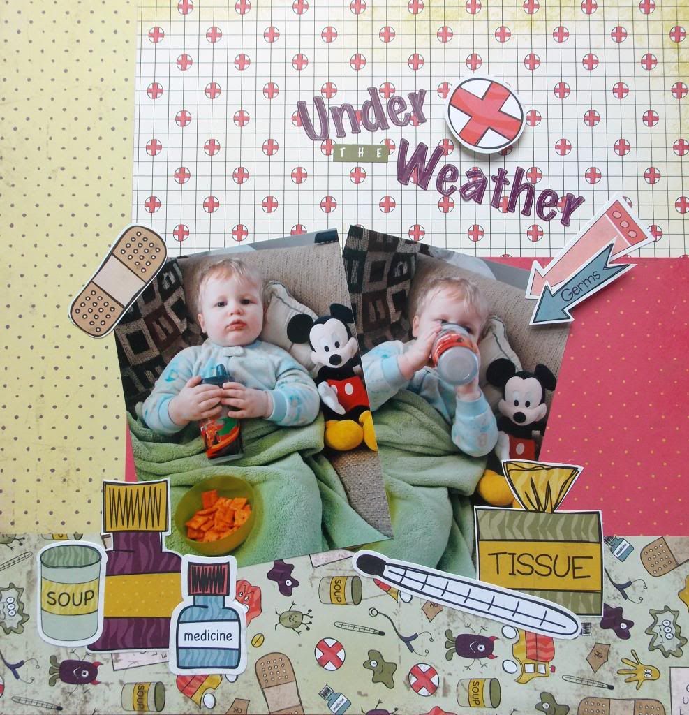
I was reading this Anatomy of a Double Page Layout post on the My Mind's Eye blog this morning and thinking about the color green (it must have been all the challenges out there for St. Patrick's Day) when I knew I had to dig out the Get Well Soon Nikki Sivils collection and these photos of my son.
I immediately knew what I wanted this layout to look like. Taking tips for the post I mentioned I started with a white sheet of paper, my ruler and a pencil. I sketched out where I wanted my papers and started cutting and pasting. After fussing with the embellishments for awhile I ended up with cute page!

No comments:
Post a Comment