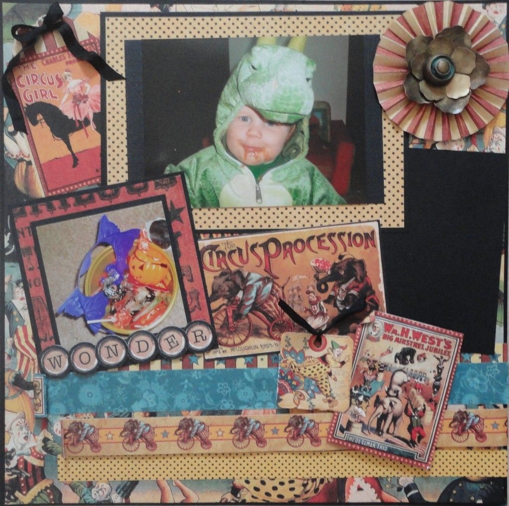
Here is what I created
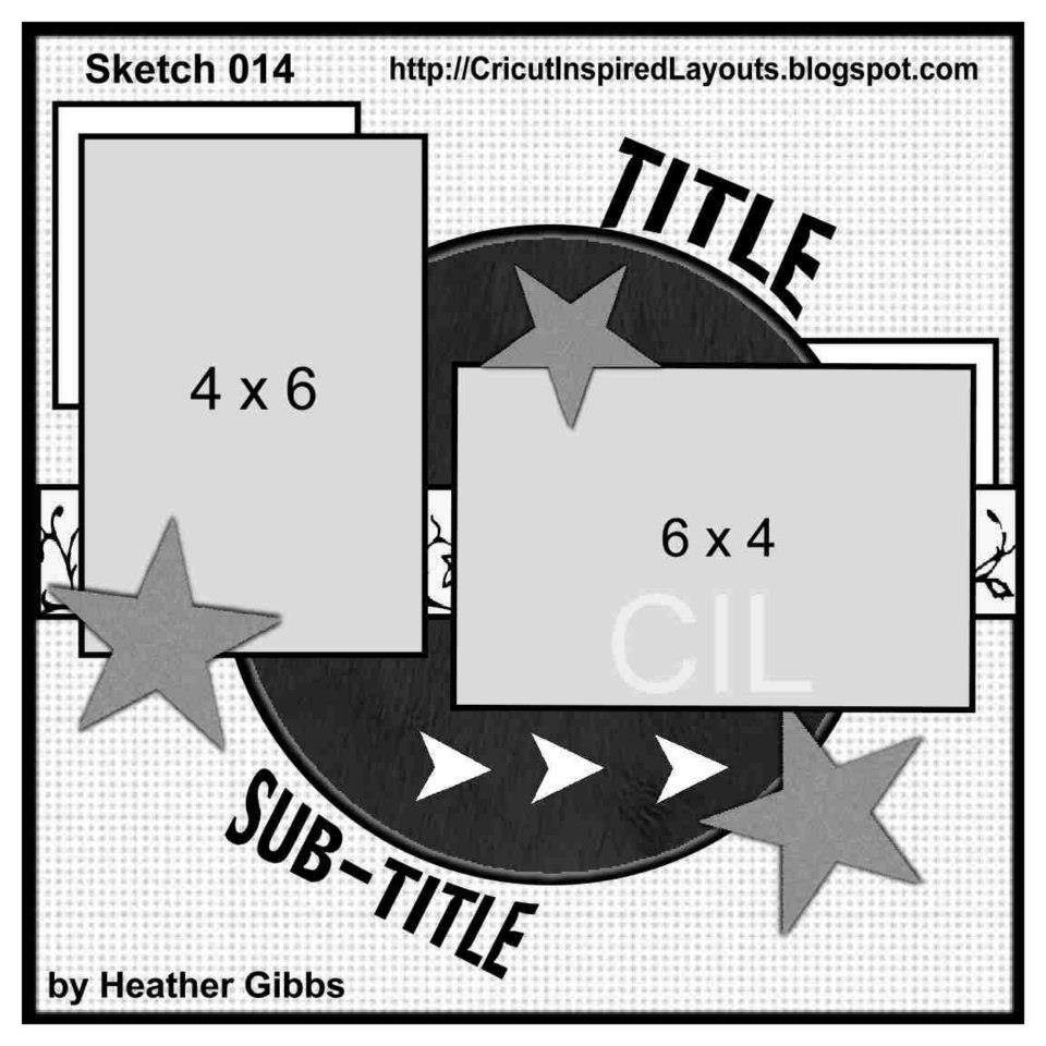
from this sketch.
Now I know what you may be thinking, "How on Earth did she get that layout from that sketch?!?". So I'm going to show you how my mind works (scary!) when it comes to sketches that may not inspire me right off the bat.
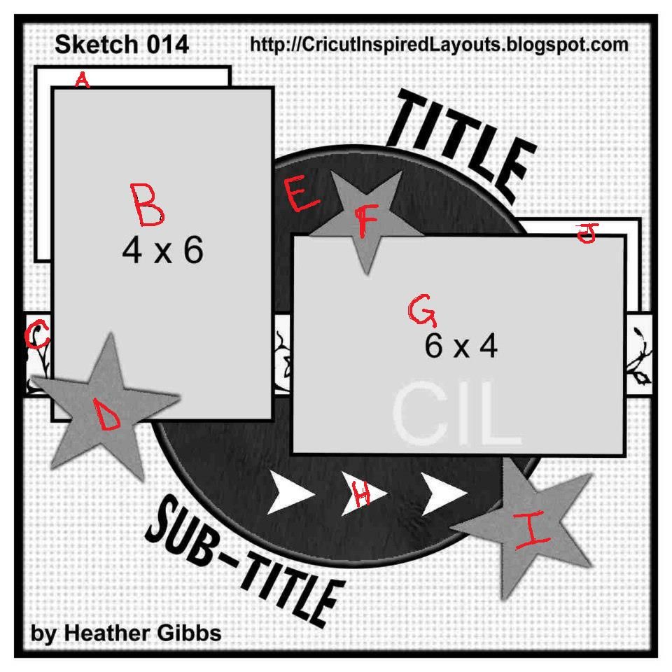
First I take the sketch and mentally number (or letter) the main elements. Like this
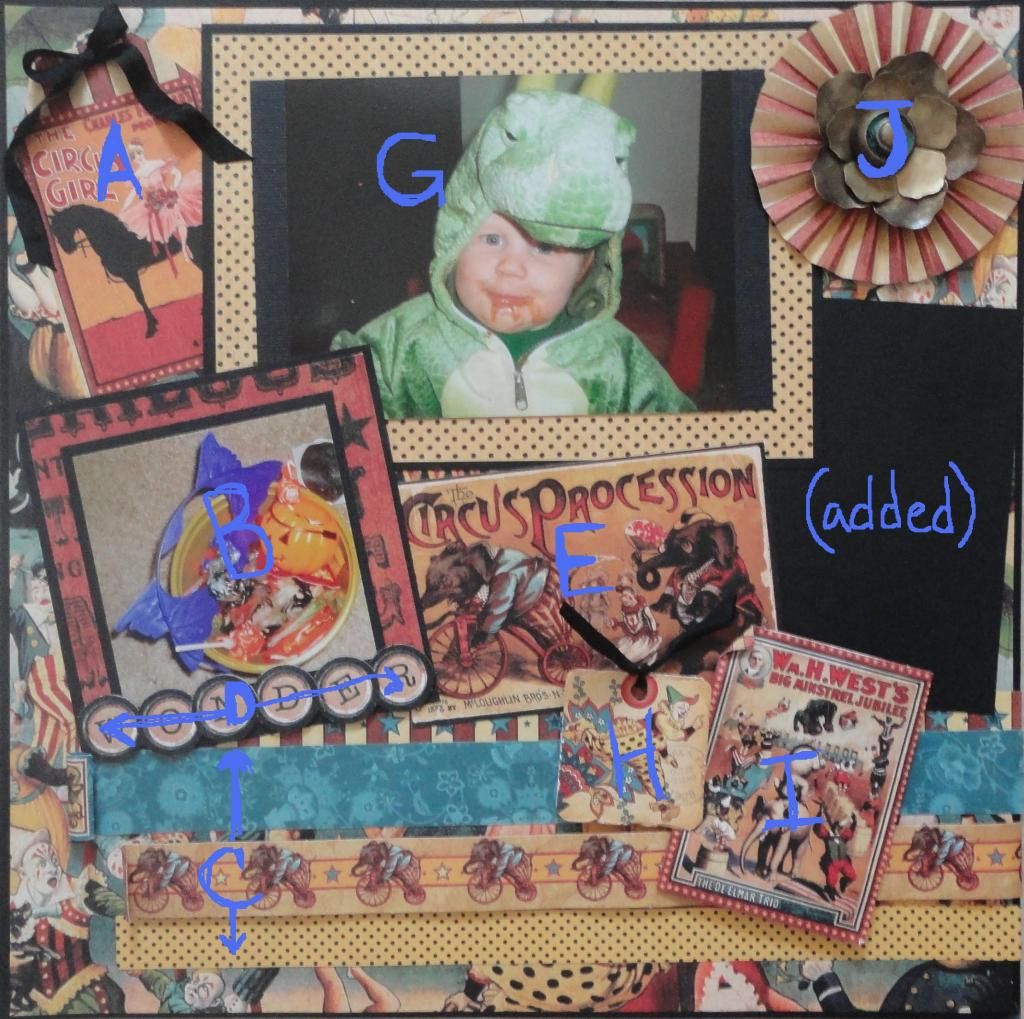
Then I take those elements and rearrange (slightly) and reimagine them. This is how the letters translate to my layout
Allow me to explain
A = the tag is pretty close to the peaking square in the sketch
B = I kept this a picture but changed the size
C = is still a boarder but there are more of them and lower
D = the star (embellishment) became long
E = I find large elements, like this circle, difficult to work with. So I shrunk it way down and made it a rectangle
F = I omitted
G = this photo became larger and higher
H & I = are still grouped embellishments
J = like A, I made the peaking square and larger, more visible element
I added the black journalling block because it gives me a vertical element and my pictures have a story behind them that I want to share.
I hope I've given you some ideas and inspiration for taking sketches and thinking outside the box. Be sure to stop by Red Carpet Studio to see what the other members of the Layout Design Team created and submit your own layout based on the sketch.
SPONSOR: Scraptastical Kreations
PRIZE: $15 Gift Certificate


No comments:
Post a Comment